A new chart developed in Iran can help physicians identify women who are at high risk for breast cancer. Doing so could make a breast cancer screening program more efficient and productive, suggested the researchers who developed the chart.
A group from Hamadan University of Medical Sciences in Iran created a color-coded breast cancer screening chart that is designed to predict and stratify an individual's risk of breast cancer. The team based the chart on existing risk prediction models for other conditions, such as hypertension, and plan to use it within the country, according to Dr. Jalal Poorolajal, PhD, an associate professor of epidemiology at the university's School of Public Health.
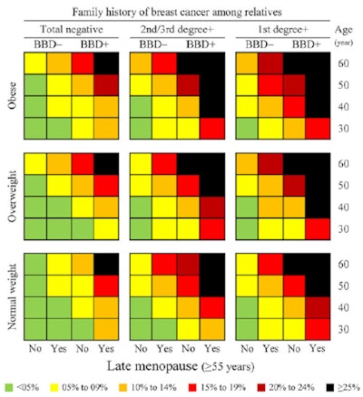 Breast cancer screening chart for estimating the risk of breast cancer by demographic and clinical characteristics. BBD- = negative breast benign disease, BBD+ = positive breast benign disease. Image courtesy of Dr. Jalal Poorolajal, PhD.
"The rationale of developing this chart was to improve and enhance the performance of screening mammography in order to reduce false-negative results," Poorolajal told AuntMinnieEurope.com.
Risk factors beyond age
When it comes to mammography screening guidelines, age is often the guiding factor for determining who should be screened. But what about the other risk factors, such as family history, BRCA mutations, higher body mass index (BMI), hormone use, and early menarche, to name a few?
Poorolajal and colleagues argue that screening the entire population is a wasteful use of resources and may identify only a few previously undetected cases compared to the amount of effort involved. However, if high-risk individuals could be identified and screening is directed at them, the program could be more productive. First things first though: Identify the high-risk individuals.
"By considering risk factors of breast cancer, it is hoped that high-risk individuals are detected easily," the study authors wrote (Journal of Public Health, 15 May 2017). "A screening program is more productive and efficient if it is targeted to a high-risk population, otherwise it can be wasteful of resources."
They enrolled 1,422 women from Tehran, Iran, including 506 women with confirmed breast cancer as the case group and 916 women without breast cancer as the control group. Their questionnaire included age, weight, height, age at menarche, number of children, age at first delivery, menopausal status, age at menopause, having a benign breast disease (fibrocystic disease, fibroadenomas, pseudoangiomatous stromal hyperplasia, and adenosis), history of breast cancer in first- or second-/third-degree relatives, history of hormone replacement therapy (HRT), and presence or absence of BRCA gene mutations.
Using the data, the researchers stratified and colored the risk probabilities of breast cancer as follows: less than 5% (green), 5% to 9% (yellow), 10% to 14% (orange), 15% to 19% (red), 20% to 24% (brown), and 25% or greater (black).
The biggest risk factors were the prevalence of a higher BMI, late menopause (55 years or older), benign breast disease, positive family history with breast cancer, HRT, and BRCA mutation, as evidenced by the high incidence in breast cancer cases. However, the prevalence of early menarche (11 years or younger) and age older than 30 at first delivery for childbirth was higher in controls than in cases.
"The main message of the breast cancer screening chart is that age alone is not a strong predictor of breast cancer," the authors noted.
Looking at only age, all subjects have less than a 5% risk, according to the chart. However, risk increases from left to right independent of age as risk factors are added.
"This indicates the importance of other risk factors of breast cancer that we should consider when recommending mammography," the authors wrote. "The chart represents a modeling approach that facilitates making [a] decision on the threshold for recommending screening mammography. The appropriate threshold (10% or 15% risk, for example) depends on the availability of resources in each country or World Health Organization (WHO) subregions."
However, the chart has some limitations, namely it was based on data from a local case-control study rather than a national prospective cohort study, and the researchers predicted the risk probability based on the data. Also, the chart is not extended to older ages due to the limited number of cases the researchers included.
Despite the limitations, they assert the tool can be easily used and can be applied even in the first-line primary healthcare in low-resource settings.
"By using the chart, a health worker in primary healthcare can measure and classify the average risk individuals for breast cancer and, if necessary, refer them for appropriate action to the next level of care," they wrote.
As a final word of caution, they acknowledged this chart is not perfect and needs to be refined and adapted to each country or WHO subregion.


